Inputs
Create custom input components that respond to gestures.
Tap
Set mode='tap' to make a box respond to taps or mouse-clicks. The box must be located inside a parent box with mode='input'.
The tap box returns its value when tapped or clicked, or its text if a value is not provided.
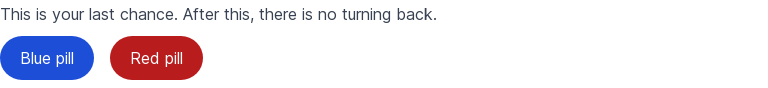
def style(color):
    return f'text-white rounded-full px-5 py-2.5 text-center mr-2 mb-2 bg-{color}-700 hover:bg-{color}-800'

color = view(
    'This is your last chance. After this, there is no turning back.',
    row(
        box('Blue pill', mode='tap', value='blue') / style('blue'),
        box('Red pill', mode='tap', value='red') / style('red'),
        mode='input',
    ),
)
view(f'You took the {color} pill!')
More
Set mode='more' to make a box display context menus on any box. The box must be located inside a parent box with mode='input'.
The more box returns the value of the chosen context menu.
choice = view(
    row(
        box(
            box('B') / 'text-white text-xl font-light',
            mode='more',
            options=[
                option('profile', 'My Profile'),
                option('security', 'Security'),
                option('notifications', 'Notifications'),
                option('settings', 'Settings'),
                option('theme', 'Theme'),
                option('support', 'Support', options=[
                    # Nested sub-menu
                    option('knowledge_base', 'Knowledge Base'),
                    option('chat', 'Chat with us'),
                    option('talk', 'Call us'),
                ]),
                '',  # Divider
                option('signout', 'Sign out'),
            ],
        ) / 'flex items-center justify-center w-10 h-10 rounded-full bg-pink-500',
        mode='input',
    ),
)
view(f'You chose {choice}!')
