Styling
Change how boxes look: colors, borders, sizing, margins, and padding.
Basic
Set style= to control how a box looks. Nitro supports Tailwind styles.
view(
    box(
        'Hello world!',
        # p-4: Padding, 4 units wide.
        # border-l-4: Border on the left, 4 pixels thick.
        # text-sm: Small text
        # font-medium: Medium font
        # text-sky-700: Dark blue text
        # bg-sky-50: Light blue background
        # border-sky-700: Dark blue border
        style='p-4 border-l-4 text-sm font-medium text-sky-700 bg-sky-50 border-sky-700',
    ),
)

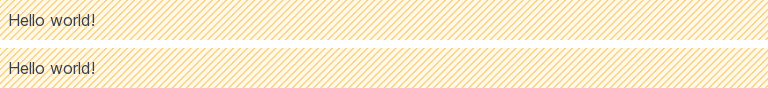
Shorthand
box(...) / X is shorthand for box(..., style=X).
view(
    box('Hello world!', style='p-2 bg-stripes-amber'),  # Longer
    box('Hello world!') / 'p-2 bg-stripes-amber',  # Shorter
)
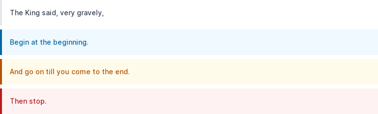
Derived boxes
New boxes can be created from existing boxes. In many circumstances, using derived boxes simplifies your code and makes it more readable.
The example below creates different kinds of alerts from a base alert.
alert = box() / 'p-4 border-l-4 text-sm font-medium'
info = alert / 'text-sky-700 bg-sky-50 border-sky-700'
warning = alert / 'text-amber-700 bg-amber-50 border-amber-700'
failure = alert / 'text-red-700 bg-red-50 border-red-700'

view(
    alert('The King said, very gravely,'),
    info('Begin at the beginning.'),
    warning('And go on till you come to the end.'),
    failure('Then stop.'),
)
Alert example
The following example starts with a plain box and incrementally applies styles to create an alert box.
text = "I'm sorry, Dave. I can't do that."
view(box(text), ['Increase font weight'])
view(box(text, style='font-medium'), ['Make text smaller'])
view(box(text, style='font-medium text-sm'), ['Change text color'])
view(box(text, style='font-medium text-sm text-red-700'), ['Change background color'])
view(box(text, style='font-medium text-sm text-red-700 bg-red-50'), ['Add padding'])
view(box(text, style='font-medium text-sm text-red-700 bg-red-50 p-4'), ['Add border'])
view(box(text, style='font-medium text-sm text-red-700 bg-red-50 p-4 border-l-4'), ['Change border color'])
view(box(text, style='font-medium text-sm text-red-700 bg-red-50 p-4 border-l-4 border-red-700'), ['Restart'])

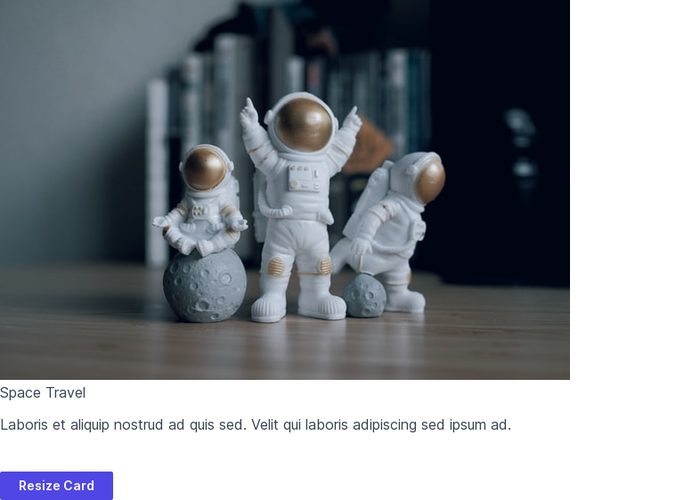
Card example
The following example starts with some nested boxes and incrementally applies styles to create a card.
title = 'Space Travel'
text = lorem(2)
image = box(image='sample.jpg')
view(box(image, col(title, text)), ['Resize Card'])
view(box(image, col(title, text), style='w-72'), ['Round corners'])
view(box(image, col(title, text), style='w-72 rounded-xl'), ['Crop contents'])
view(box(image, col(title, text), style='w-72 rounded-xl overflow-hidden'), ['Add shadow'])
view(box(image, col(title, text), style='w-72 rounded-xl overflow-hidden shadow-xl'), ['Add padding'])
view(box(image, col(title, text, style='p-4'), style='w-72 rounded-xl overflow-hidden shadow-xl'), ['Make title bold'])
view(box(image, col(box(title, style='font-bold'), text, style='p-4'), style='w-72 rounded-xl overflow-hidden shadow-xl'), ['Make title larger'])
view(box(image, col(box(title, style='font-bold text-xl'), text, style='p-4'), style='w-72 rounded-xl overflow-hidden shadow-xl'), ['Make text smaller'])
view(box(image, col(box(title, style='font-bold text-xl'), box(text, style='text-sm'), style='p-4'), style='w-72 rounded-xl overflow-hidden shadow-xl'), ['Restart'])